Building an Annotation Workflow to Train OCR Models
My Role
UX Designer-Vendor Collaboration
Duration
Planned - 60 days
Actual - 60 days
Design Team Size
4
Key Responsibilities
Responsible for user research, flow design, IA definition, concept design and final wireframes.
Worked with annotators, tech teams and business stakeholders to build the platform from ground zero.
Overview
Problem
The challenge wasn’t just the UI. It was figuring out:
- How annotators think
- What the machine learning model needs
- Where mistakes happen
- And how to build a tool that keeps both human flexibility and machine structure in sync
key challenges
Tech Context – Why This Was Hard (2019)
Training ML models to read insurance forms wasn’t just about tech — it was a disorderly, slow process that needed coordination between designers, annotators and engineers.
Insurance forms weren’t consistent
The diverse and inconsistent form layouts from insurance companies, ranging from typed to handwritten formats with varying field names, presented a significant challenge. There was no defined structure to depend on.
Clean data was scarce
ML models needed thousands of annotated examples — each one manually labeled with exact field names and pixel-accurate boxes. We had to create this data from scratch.
OCR had limits
OCR tools can grab raw text, but couldn’t understand and explain the context. We had to design workflows that combined human markup with machine output to make it usable.
Everything had to be built
We had to work with bad scans, smudges, stamps and low-resolution uploads. Nothing was ready-made. Every step — from deskewing to model feedback — had to be designed into the tool.
Human supervision was essential
In 2019, no model could run this process without supervision. Annotators played a key role — verifying, correcting and helping train the system through their work.
Goal
How I Approached it?
I started with a diary study with six annotators to see how they actually worked — not just what they said.
We engaged with stakeholders to unpack goals, constraints and possible failure points through a 2-day workshop. During the workshop, stakeholders highlighted specific issues such as inconsistent annotation processes and lack of standardization in form handling. These insights led to the development of a targeted solution that streamlined annotation workflows, ultimately reducing errors and improving overall process efficiency.
We also coordinated with the tech team to learn and understand how OCR would read inputs. This shaped how we designed the steps — not everything could be flexible, and not everything could be fixed after submission.
Mapped the service as a multi-step workflow:
Correct image → Mark fields → Detect and delineate tables where required→ Link data to respective labels → Verify before submission with the annotator
We designed each screen around the task it had to support — not just in layout, but with focus.
Each step had preset/standard defaults, clear feedback and visual hierarchy that helped users move with confidence — even if they were new to the tool.
Deliverables
Complete Information Architecture mapping document.
End-to-end UX workflows for document upload, annotation, data linking, and verification.
Detailed wireframes covering all major actions and modules.
Interactive prototypes for complex tasks like skew correction, boundary creation and table management.
IMPACT
While final delivery or tracking post-launch was out of our scope, our work enabled the tech team to
Built a structured, modular platform that scaled with growing form volumes.
Reduce training time for new annotators
Align human inputs with machine-readability from the ground up
The product was used internally to train OCR models with cleaner, more consistent data — a critical part of improving automation.
“The platform didn’t replace jobs outright — it reduced repetitive manual work, improved accuracy and gave teams the option to scale without hiring more. Over time, it also set the foundation for smarter automation, with human roles shifting toward review and exception handling.”
Reflection
Designing this platform wasn’t just about developing tools and flows — it was about changing how teams worked. We reduced friction, cut repetitive tasks and derive interpretable data. It also meant more could be done with existing human resources as automation improved.
I saw this not as “removing people,” but as shifting what people spend time on — from rework to review, from rote to reasoning. That shaped many of our design decisions — especially around clarity, feedback and fallback — to keep humans in the loop, not out of it.
Key Interface Highlights
Image Skew Correction - Simple drag handles to straighten documents before starting work.
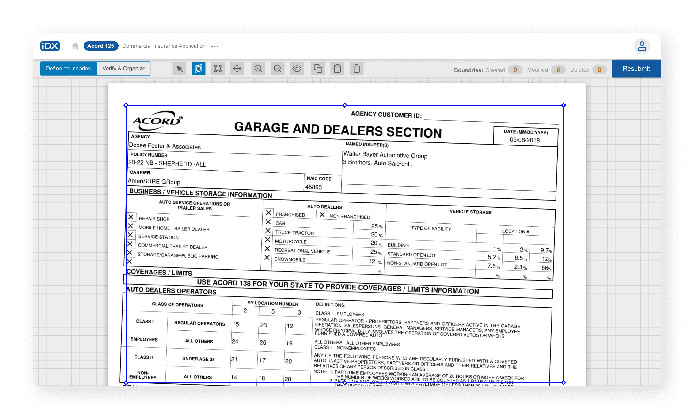
Boundary Marking - Drag, resize, and adjust fields easily, with options to fix or remove them.
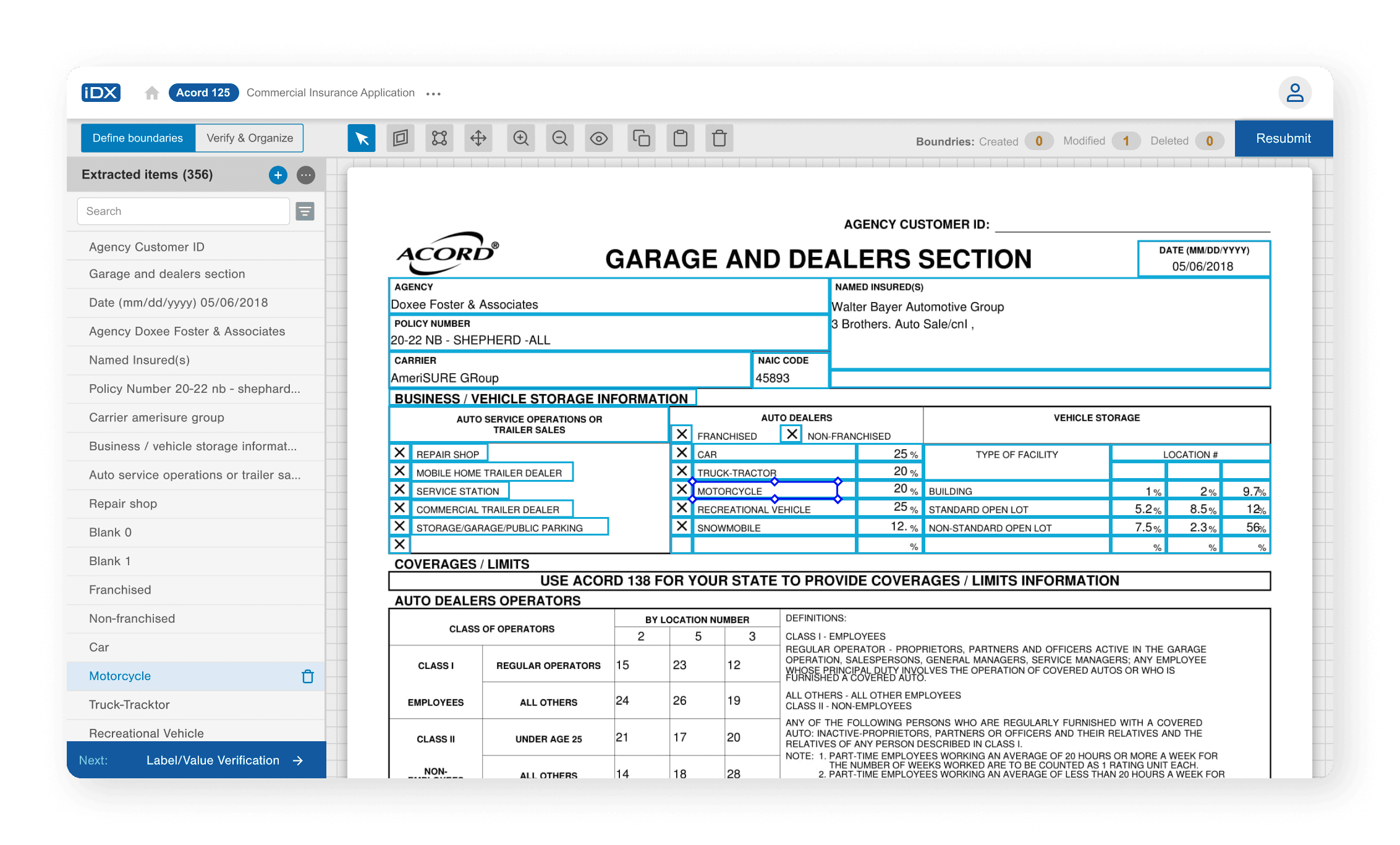
Table Creation - Tables detected automatically, with controls to split, merge or adjust cells.

Data Linking - Group related fields visually to keep linked information together.
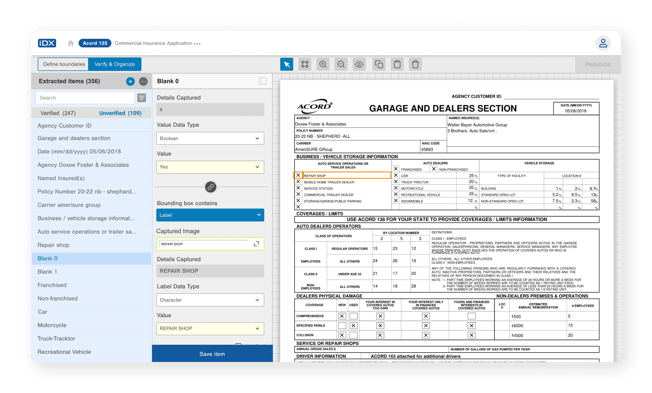
Verification and Final Submission - Warnings for missing or incomplete fields before submission to reduce errors.

Continue Reading
Continue Reading
Building an Annotation Workflow to Train OCR Models
My Role
UX Designer-Vendor Collaboration
Duration
Planned - 60 days
Actual - 60 days
Design Team Size
4
Key Responsibilities
Responsible for user research, flow design, IA definition, concept design and final wireframes.
Worked with annotators, tech teams and business stakeholders to build the platform from ground zero.
Overview
I worked as a UX Designer through a vendor collaboration with a leading banking and fintech company in India.
We were required to design a new software application to help extract information from scanned insurance forms using OCR and Machine Learning technology.
key challenges
As there was no existing application to improve upon, we had to build everything — workflows, structure and interface behaviour — from zero.
We had to understand and design for two very different needs:
Annotators needed control and flexibility, while tech teams needed clean, structured data for machine learning.
Learning how OCR worked and earning the trust of the annotators was critical. We also had to quicken the work pace without missing important details.
Goal
The goal was to create a clear, flexible platform that made document processing faster. It needed to work well for people marking up forms by hand while fitting the needs of machine learning systems reading the same documents later.
How?
We started off collaborating wiht the product owner and six annotators to understand their daily tasks, how they achieve them, difficuties and blockers using diary study.
Identified the annotator's key pain points and actions that may help them to do their work better by watching how they currently annotate the scanned insurance documents.
Worked closely with the tech teams to learn how OCR technology works, and how it processed the scanned documents, where human fixes were required, and how to match human works with the machine outputs.
Using this, we created an information architecture and refined it over multiple rounds of discussion and feedback.
Early concept screens helped us test ideas quickly before moving to detailed wireframes.
We noticed that certain number of issues came from the improperly scanned documents. So we created a set of guidelines to rectify some errors even before it entering the system.
Prototyped a single user journey to test our concept with the annotators. We received a positive feedback from the annotators which later helped us to refine the concept further.
The final set of wireframes supported primary tasks like deskewing images, marking fields, drawing new boundaries, building tables, linking data and submitting finished annotations for training the model.
Everything was designed to support both manual flexibility and growing automation over time.
Deliverables
Complete Information Architecture mapping document.
End-to-end UX workflows for document upload, annotation, data linking, and verification.
Detailed wireframes covering all major actions and modules.
Interactive prototypes for complex tasks like skew correction, boundary creation and table management.
IMPACT
The final design gave teams a strong platform that made manual annotation easier and prepared the system for future automation.
It combined human flexibility with machine-readiness without extra complexity.
The tech teams were able to plug in OCR and machine learning features without major redesigns.
Direct quantitative impact post-launch was outside our engagement scope, but the design was positioned to accelerate automation, reduce manual effort, and improve scalability over time — aligned with the project’s technical and business goals.
Key Interface Highlights
Image Skew Correction - Simple drag handles to straighten documents before starting work.
Boundary Marking - Drag, resize, and adjust fields easily, with options to fix or remove them.
Table Creation - Tables detected automatically, with controls to split, merge or adjust cells.
Data Linking - Group related fields visually to keep linked information together.
Verification and Final Submission - Warnings for missing or incomplete fields before submission to reduce errors.
Continue Reading
Continue Reading
Reflection
Designing this platform wasn’t just about developing tools and flows — it was about changing how teams worked. We reduced friction, cut repetitive tasks and derive interpretable data. It also meant more could be done with existing human resources as automation improved.
I saw this not as “removing people,” but as shifting what people spend time on — from rework to review, from rote to reasoning. That shaped many of our design decisions — especially around clarity, feedback and fallback — to keep humans in the loop, not out of it.